Wednesday, December 21, 2011

Studio Project: Transformation

Here is my final studio project (complete with the script I read during my presentation...):


My journey into the topic of transformation began with an investigation of stimulus and response. I diagrammed and read about how light, specifically heliotropism, affects plant life. Through this study, I came to focus my solution for the hillman house on a light screen that also acted as a room separater and a shelving system at the same time. The problem was that it became anything but focused. So, rather than tackle three solutions in one, I decided to simplify and concentrate on improving one thing with thoughtful decisions and careful study.

 Existing house and conditions (window to the right is where the project focuses.)

Like many of us, I chose to address the large window wall in the living room, which sits on the project's western side. I noticed the beautiful view captured by the window, but the potential issue of a harsh light entering in at certain times during the day. I also made note that the existing furniture plan avoided placing a chair in front of the window- whether that be to prevent blocking a view or because of the potential for direct sunlight in that spot, I'm not sure. I asked myself, how can I create a spot that allows for both the enjoyment of the view and also a favorable lighting condition? In my solution I have chosen to place a tufted ottoman or bench in front of the window, low enough to prevent a blockage of the view, but inviting enough to lay down or sit on for a direct view of the trees. 

Plan view with proposed seating.
 
In focusing my study of light I calculated the solar elevation and azimuth based on the orientation of the house as well as its latitude and longitude for four times of the year, January, April, July, and October. I tried to choose one from each season in an effort to best understand how the sun would behave throughout the year. I charted both the angle at which the sun would enter the room horizontally for every hour from noon to 5pm for the four times selected throughout the year. I also charted the angle of elevation of the sun and how deep into the room the sun would enter. From here, I was able to understand the movement of the sun throughout the year as we've all been taught, but understand it in a way specific to the hillman house. 
 Solar Azimuth Angles into the window.
 Solar Elevation into the window.
 
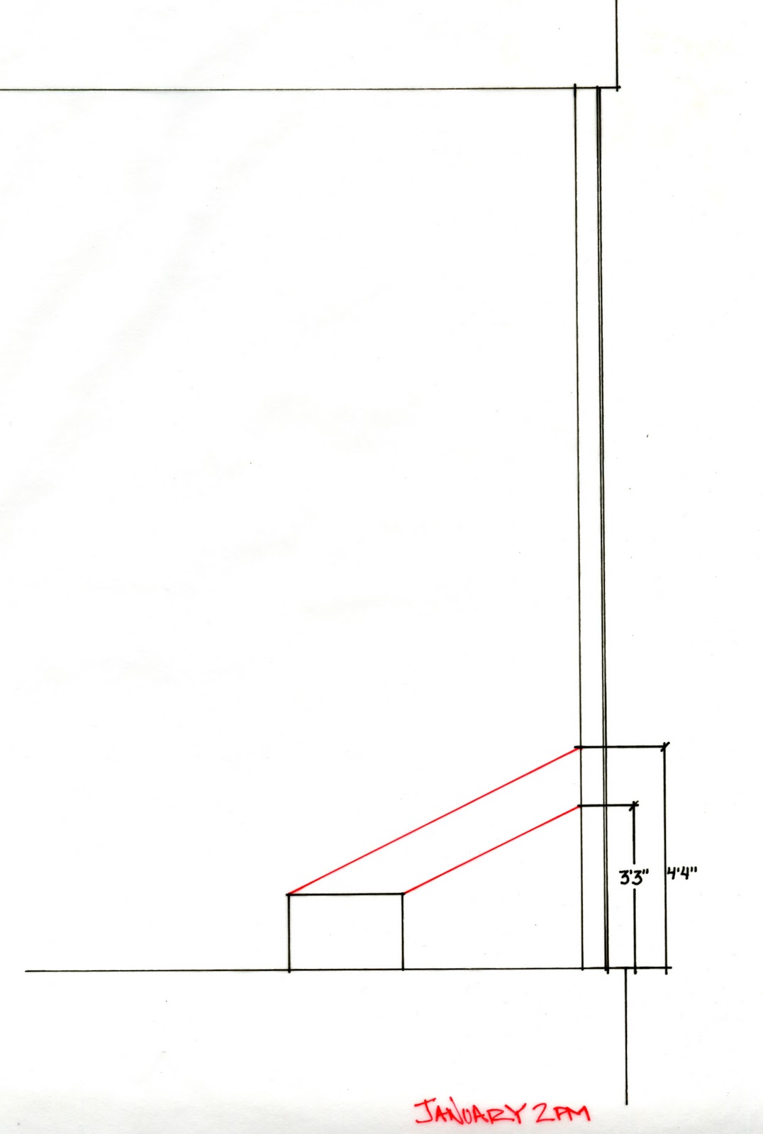
I needed a way to narrow down the scope of these times and so I thought about what times during the year the sun might be the harshest. During July the sun may stay out longer, however the trees would have leaves on them, reducing the need for shading during that month. In October, many of the leaves may still be on as well. January's light, lower in the sky, would reach into the room and would not have the shade of the trees. April, similarly may just be producing vegetation, and so I chose these two times to focus the shading of the bench.
As the sun travels over the sky, the angle of the sun in the living room becomes wider and so I wanted to pick times during the day where the sun may be the harshest. I noticed the sun came directly into the room at 3pm during April, so instead of trying to block the sun during that time, I chose 2pm and 4pm and designed the screen to provide shade during those times. Because I knew that this was the time of day where the sun was the most direct, if I was able to space the slats in a way that blocked the sun during these times, then I could be certain that during the other times of the day, where the angle is less obtuse, the shading would still apply. I put this same theory into practice for the month of January, choosing 2pm and 3pm. 
  
After charting the azimuth and the elevation for these four times, I placed the bench into the equation and determined the distance along the window that would affect the bench during that time. 


By combining the horizontal and vertical angle of the sun for each time of the day against the window according to the bench, a grid was created. For instance, in April at 2 pm between these two x-coordinates and these two y-coordinates, this block of sun falls directly onto the bench.


So, how to handle the light in these spots? The goal was to create ambient light that first hits wood slats instead of direct light. As for the slats, I came to a few conclusions. First, when determining the slats' characteristics there were three things to take into consideration. Slat depth, spacing and angle. Deciding to keep the angle of the slats rigid and perpendicular to the window, preventing any further obstruction of the view, I was left with the slat depth and the spacing. I noticed that for the same angle of light, you could have different spacing by changing the depth of the slat. The shorter the depth, the closer together the slats must be and vise versa. I went back to my charts and determined the spacing best suited for each time of the day. 

 
The final result has four different conditions. April at 2 pm- slats 10 inches deep, 3 inches apart. April 4 pm became an open space because the angle of the sun was such that its time affecting the bench was so little, I chose to keep it open. Jan. 3pm slats are 8 inches deep and 4 inches apart. Jan. 2 pm- slats 6 inches deep 6 inches apart. This way, someone could sit or lie on the bench anytime past 4pm and up until 2 pm and always have a shaded seat. Light would come in directly, however it would fall past the bench on all four sides, but never directly onto it.
Lastly, I took into consideration the structure as far as construction. In keeping with the precedents set forth in the house, the light shade would be constructed of either maple or teak and the bracing would be steel. Steel angles and structural tees are used as supports with screws entering the slats from the window side.


Construction Drawings have been darkened for best resolution on the computer.

And so this is my solution for a way to both transform and respect the hillman house.


Friday, November 11, 2011

Concept

So for my newest studio project, I have been looking at the term transformation.  We have been researching different ways of expressing transformation in an effort to understand and apply a concept to a house built by W. G. Clarke, the architect who designed Campbell Hall (seen here in the most recent post).  Anyway, I turned to biology (who would've guessed it?) and I've  been studying heliotropism.  That's the plants reaction to the sun as it turns its leaves and "body" towards the sun as it moves in the sky from east to west throughout the day.  I took a look at some great time lapse video and then made a little study watercolor painting:

 
After watching the video and then doing the watercolor, I drew some diagrams to further study the topic and then I made some time lapse photography myself!  I was just studying transformation by layering color through movement and additive and subtractive experiments.


And then this one...

Friday, November 4, 2011

Inspiring Architecture

Thursday our studio had the opportunity to tour Campbell Hall at the University of Virginia.  Not only did we get to tour a beautiful building with insightful details and thought, but the tour was led by the lead architect for the project, W.G. Clark.  It was such an inspirational trip- from the use of humble materials in meaningful ways to the beauty of the students' models laid out on their studio tables.  I think it was just eh Kick-in-the-a*$ I needed to get moving and MAKE THINGS.  I need to stop talking and thinking about my ideas and start documenting in the form of models, sketches, etc.  That's what this weekend will be for me.  Oh and celebrating a studio-mate's birthday, but I digress...

Back to the building.  Here are a few images from our trip.

The first few images are student artwork from a study abroad trip they went on.


 The stairwell up to the upper floors was a beautiful study in translucency and steel.  Because of the way the stairs were constructed, the landings fell in between floors, providing elevated "in between" places that caught glimpses of two floors at once in some cases.

Unfortunately, I didn't take any pictures inside the building because I was too busy listening to the insightful W.G.  Here is a picture of the outside facade of the building with its glazing.  The architects wanted the look of a collage.

Around the back of the building, slate was used to pay homage to the history of the University, but update the application.  Slate is typically seen as a roofing material throughout the campus, but here, it is used as a cladding for the exterior walls.  

Louvres move with the sun, creating a filter on the south side of the building so the light is not directly shining into the faculty offices.


The next few pictures are of the outdoor classroom that was created to be a meeting and teaching space.  It is a very cool spot to engage in discussions, featuring an entire wall of blackboard and water collection feature.  How cool would it be to have a class outdoors in this space?


Finally, a picture of my awesome classmates and our professor who was kind enough to set this all up for us (and also worked on the project!)

Friday, October 28, 2011

Studio Project: Construction Documents

My studio this semester is focused on construction documentation.  Those are all the drawings necessary to communicate a design idea or intent and actually make it a real, built structure.  We were asked to create an "ikea-like document" showing how our armature for the art exhibit (described in this previous post) would be built.

Here is the original documentation I came up with:


We were then asked to try to take these drawings and incorporate our photos to create something worthy of a page right out of our portfolio.  I think if I had more time, I would change a few things about these and add some written annotation and descriptions.  Keep in mind, these would be viewed side by side, so the lines would continue onto the next page....


Happy Friday :)

Monday, October 24, 2011

And....I'm Back!

I know all of you have been sitting at home waiting for this very moment.  That's right.  Seed is up and running again! 


Ok, so maybe that isn't the case.  That's ok.  Either way, I realized tonight that as hard as it is to keep up a blog (it really is, folks!), it helped me be a better designer.  I'm not sure if it is the pressure of writing a good post so you people are interested, or just getting my thoughts down.  I think writing about what I was doing helped me find holes in my work and try and fix them.  I'm not sure if it's my particularly productive mood tonight, the music I'm listening to, or the fact that I was just watercoloring and that tends to completely seduce me into thinking I have things in control, but whatever the case, I made the decision to start blogging about my work again.


That's not to say I won't have my weeks when things are a little tough, so hang in there with me if you will.  I'm currently trying to go to school full-time and work three jobs (five days a week.)  It's been alot, but in the end, I keep telling myself- I can do anything for one year.  All the hard work will pay off eventually.  And, luckily, I've managed to get some play time in there also :)

I'll start by telling you a little bit about my first studio project.   The task was to create a moving art exhibit that could be taken apart, put into a van, taken to the next city and put back together.  We started by going to the VMFA and choosing 12 items to compose our exhibit.  I didn't really have a rhyme or reason for the items I chose, I just sketched the ones I was most drawn to.

Then I had to figure out how to relate them.  In the end, it boiled down to a conversation about what is art?  Is intentional art different than unintentional art (or in other words, does a painting differ in its meaning versus a pair of native american moccasins that were made for purpose, but with the craft and decoration worthy or art?  Finally, I categorized the pieces in a way that composed three groups- the artistry of craftsman, fine art and modern art.

Then it was time to figure out how to build a structure that spoke to these three groups.  My brain was all over the place.  Ceiling height, floor, changes, thickness of wall, height of art piece...etc. etc.  That's when it came time to make some rules for myself and narrow things down so I could actually get some work done.  So I made a study model for each group- something I thought represented the group and I came up with these three (a framed structure for the craftsman, a floating planar structure for the fine art pieces, and a simple box for the modern art):


Once I determined the three building languages, I began thinking about how to represent each in the structure and I came up with this (well, after alot of drawing and thinking and building...)

 Someone would enter from this side and notice the framed wall with the craftsman pieces.  A decision was made to create a floating ledge around the whole space (12'x12' was the maximum space allowed).  This decision was made in order to announce the fact that all of these are art pieces and should be viewed equally.

 The entrance:

 The final model:

So, that's what I've got folks.  Hope I can keep this up!  We had to make construction document drawings to show how to put this bad boy together, so I'm thinking I'll share those in my next post. 

Night!